


.svg)


How UX shaped the evolution of the SnapScan Wallet

Marelieze
5 August, 2021
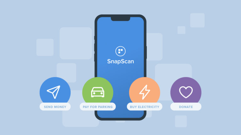
One of the biggest projects the Product Design team has recently undertaken is transforming SnapScan’s Wallet feature. Tam Lunt, Loren Carter, and I worked together to make the SnapScan Wallet, which allows people to quickly send money to friends, more user-friendly. This article will give you a behind the scenes look at how our UX and UI team tackled the evolution of a feature with a lot of potential.
Understanding the user problems
When the SnapScan Wallet was first created, users were checking it out but active adoption was low. The team realised it was time for a fresh set of eyes to see why more users weren’t making use of the Wallet.
Read more: The SnapScan Wallet: the digital account you didn’t know you needed
Step 1: Using our team’s knowledge to identify some problems
We started by looking at the existing flows of the Wallet to identify key points where we could improve the experience for our users. We needed to figure out how new features could be incorporated and where we could fix existing user pain points. To do this, we asked our Customer Experience team to highlight some feedback they’d received about what users were struggling with. This was a great way to get consolidated insights from a variety of users over a longer period of time. Leveraging the teams that interact with customers on a daily basis can save you a lot of time, and ensure that the voice of the customer is heard.
Step 2: Rapidly prototyping potential solutions
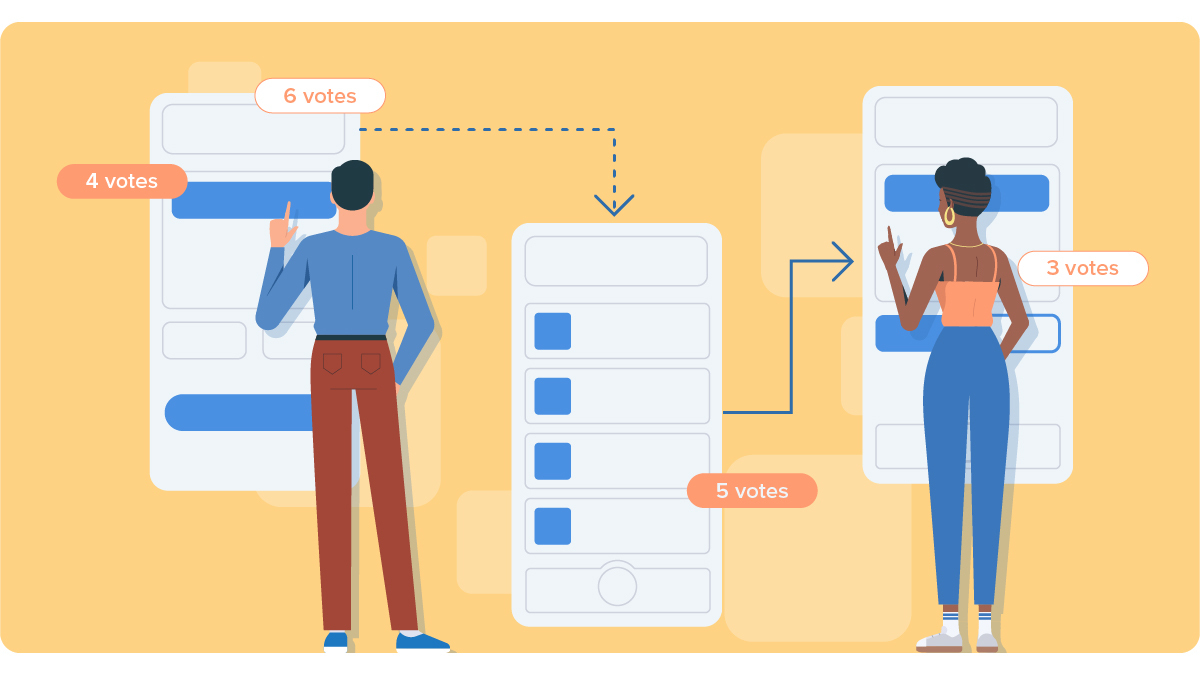
From there, we drew what felt like a hundred wireframes (basic layout sketches which demonstrate where the buttons and data that will be used in the final design will sit) to figure out which approach would be best. Keeping simplicity and ease of use in mind, we tried to make the designs as intuitive as possible, while doing justice to our brand. The designs were then presented to the relevant stakeholders, who voted on which design would go into testing.
Step 3: Validate the idea with real users
Once we were satisfied with the design, we created a fully functional prototype (yes, we are very proud of this) to put in front of some actual users. We’d made some educated assumptions about what would work for them based on initial user feedback, but as designers, we know that’s not enough – we had to make sure that real people were happy with what we were creating.
We conducted 16 remote interviews with users from all over South Africa. We asked participants about their expectations for the SnapScan Wallet, as well as their past and current experiences with peer to peer (P2P) payments. These qualitative interviews were followed with a few tasks that participants completed on the prototype to explore the proposed solutions. The tasks allowed us to assess how intuitive and usable our designs were to users and if they understood what actions were taking place.
Step 4: Analyse and iterate!
Once our interviews were done, we workshopped their feedback to identify themes. We used these themes to develop feedback on the feature’s overall user demand (this was very helpful for our Product and Marketing Teams to land product-market fit), and spot some UI and UX issues with our solutions.
From there, we took it back to the drawing board and iterated on our designs before they moved on to the Development Team.
Read more: Everything you need to know about the SnapScan Wallet
What did we actually learn?
A few interesting points came about from the testing, and we’d love to share them all but we’re not giving away all our secret sauce! To give you a taste of our user insights, here’s a look at some UX and UI errors we needed to adjust:
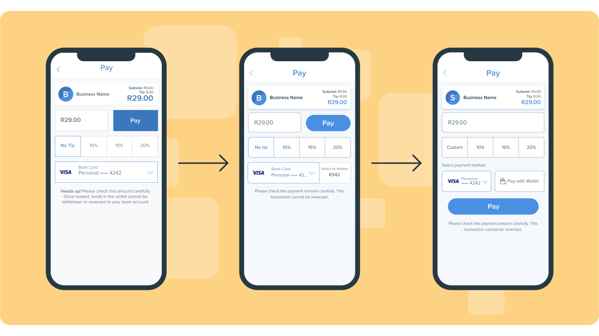
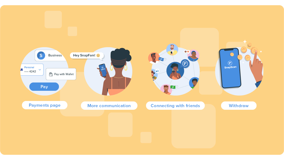
- The payments page: Users were missing the toggle button that allowed them to pay from their Wallets. We took this on board and designed something more distinctive. The feedback around this page actually led us to another project which was redesigning this page entirely.
- More communication: This was a big end-to-end problem that was identified. Users wanted more communication about various aspects of the app. Not only did users need more information about specific sections of the app to understand what to do and that it was safe, they also just wanted to be made more aware of what they could actually do on the app itself!
When it came to using the Wallet, users wanted to be notified when sending or receiving money to and from their friends. They now receive a push notification whenever their friends accept their connection request. They’re also notified when they receive money.
- Adding friends to pay: This was the feature that needed the most attention as there were some usability issues with the initial designs. We wanted to make it easier for users to add friends in the app so they could send them money. One of the ways we did this was by adding a Receive feature. When a user scan’s their friend’s QR code (located in the Receive feature), they’ll immediately be able to send money to the friend’s SnapScan Wallet. They’ll also automatically be added as friends in the app.
- Withdraw: The Withdraw feature is a new feature we designed based on feedback we received from users. Our Customer Experience Team often received requests from users who expressed the desire to withdraw funds from their Wallet. Previously, money sent to the Wallet couldn’t be withdrawn, and could only be spent at businesses with SnapScan. We introduced the Withdraw feature to give users the ability to easily withdraw their funds to their personal bank account. To do this, users would need to first verify their apps before being able to successfully withdraw their funds.
Product design is never really finished
With the user input we received, we actioned all the usability errors that were identified. But, even before we had launched the most recent updates of the SnapScan Wallet, our Product Design team was back on the project working to improve the user experience even more. Our product process is still changing quite a bit, but one thing will remain the same: we listen to feedback, test our ideas, and keep on pushing ourselves to build a product our community loves.
It’s always nice to look back and remember the work we have accomplished, and see how far we have come both as individuals and as a team. Who knows where we’ll be next year?
Marelieze
Related articles
The SnapScan Wallet: the digital account you didn’t know you needed
Send money in snap, or budget your expenses.
More than QR codes: how to pay with your SnapScan app
From QR codes to in-app donations. Use the SnapScan app to make easy payments.

Hack week BTS: a little gratitude goes a long way
If you had a week to make anything you wanted, what would you build? For...


Payments in a snap for every type of business
Sign up