The big design switch: moving from Adobe XD to Figma

Marelieze
28 September, 2021
Making the decision to switch design tools is never an easy one. It means redesigning most, if not all, of your work in a new application while fighting the steep uphill battle that is the learning curve. So, why do it at all?
What kick-started this decision for us at SnapScan was the sad news that our existing tool structure would no longer work together. At the time, the Product Team used Adobe XD for designing and prototyping, and Abstract for version control.
When Abstract discontinued the work on their Adobe XD beta integration, we were left with a software integration that had numerous bugs. To make things worse, once Adobe XD released another update, Abstract’s integration stopped working altogether.
Read more: How UX shaped the evolution of the SnapScan Wallet
Since having a version control tool is integral for our work (it allows each designer to create different versions of a design file, while still maintaining the original file), we had to start looking at alternative options for design software. Our team decided that the best way forward was to apply the design process we know and love – research, test, iterate.
Comparing the design tools
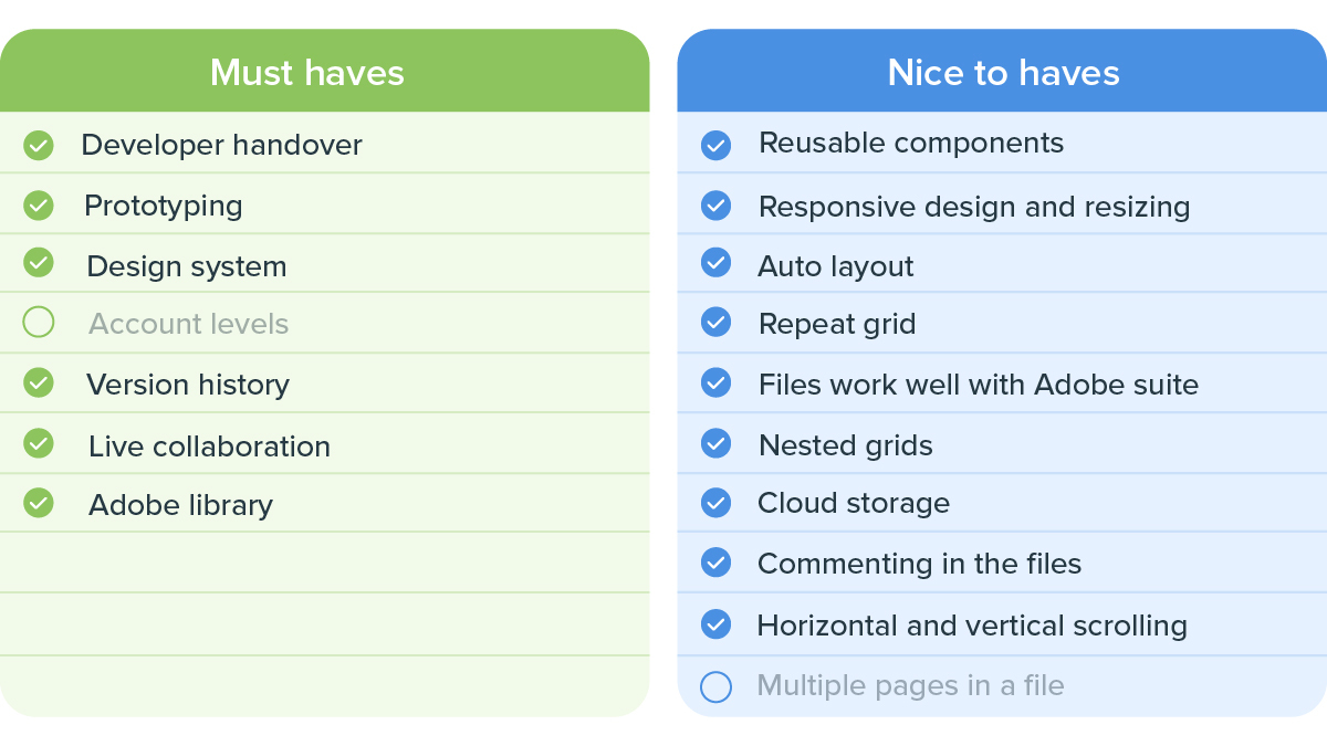
There are a wide variety of design tools on the market, each one claiming to be better than the others. We narrowed it down to the top three and looked at what they had to offer us. Things we needed to keep in mind were:
- Design and prototyping: Can we do what we need to do? Can we do it better? (I am a huge fan of optimised workflows and automation. Work smart not hard, right?)
- Version control: Does it allow us to store and access previous versions without losing our existing designs? Can other designers access my version?
- Developer handover: Does it have an inspect functionality that provides the developers with the necessary information they need?
- Accessibility to company: If a stakeholder needed to see a file, could we give them limited access?
- Collaboration: With our Product Design Team growing, how easily would we be able to collaborate and share files with each other?
- Design System: Can we house our Design System in this software? Will it be easily accessible to our designers? Will it be easy to maintain and scale?
- Cost: We had to consider the cost implications of a new tool and how it would affect our team’s budget.
Adobe XD
Writing out the pros and cons for Adobe XD was super easy for me – I had been working, living and breathing in the software since I started at SnapScan. But we had to look at what XD could offer us without any added integrations.

Cost: Financially, this would be the most ideal option as XD is part of the Creative Cloud Suite that is already covered in our budget.
– No extra cost
Read more: Behind the scenes of SnapScan’s hack week
Sketch
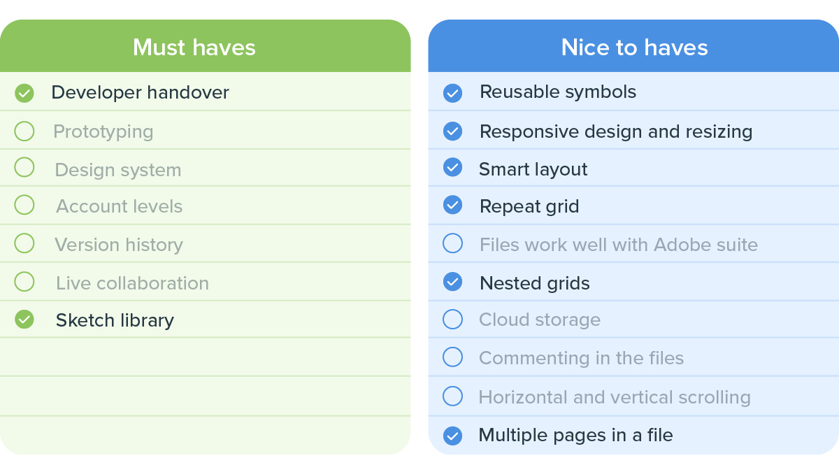
I had some, but very limited, experience working in Sketch, so I relied on my colleagues’ knowledge and experience to fill in most of the information here. I also asked them to sense check some of the information I had gathered and filled in.

Cost: Although Sketch is affordable on its own, it doesn’t have all the functionalities we require from our design software. If we went this route we’d need to use Sketch in conjunction with Abstract and Invision. Our main concern with this was the uncertainty around the stability and compatibility of these programs.
– Sketch: $9/designer, Abstract: $15/designer, Invision: $8/designer
Figma
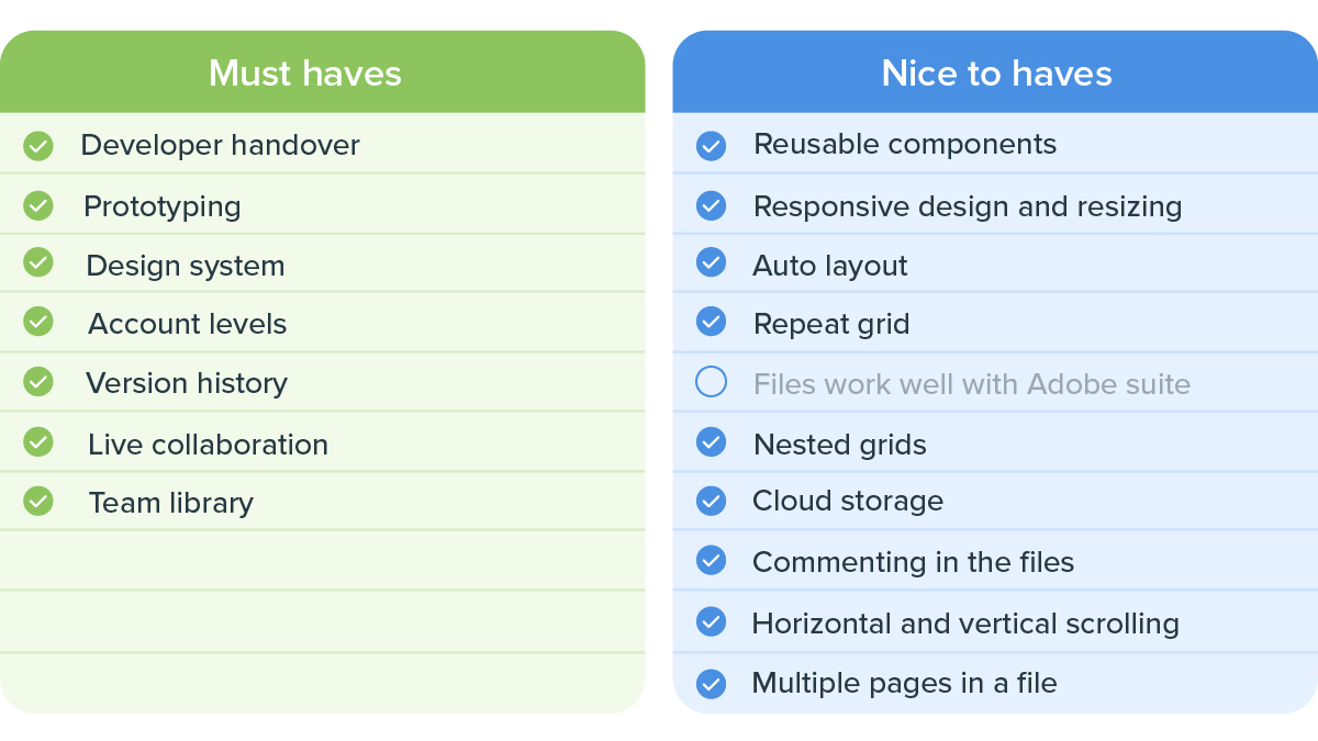
The more I read about Figma, the more I fell in love with the program. I watched dozens of tutorials and saw how simple the program was to use — even a complete novice would pick it up quickly (goodbye learning curve). The best part for me was their Design Systems feature. It allows for easy access across all teams and files, and could make maintaining our design system a whole lot easier.
Initially, one of our biggest concerns with Figma was that it lacked version control. At the time, it only had version history which had less functionality than version control. Thankfully, they released a beta version of a branching feature which provides us with version control.
Our other concern was that it had limited offline capabilities, which isn’t ideal when you’re working in a country that deals with loadshedding regularly.

Cost: The tools and features Figma had to offer very quickly outweighed the costs. Yes, it can become quite expensive but having one program that can manage everything and not having to rely on 3rd party integrations for anything is totally worth it in my books.
– Estimated $45/designer
Our final decision
At the end of the day, we took all of this data and rated our options in order of preference. Figma quickly emerged as our (very obvious) number one choice. It offered the best suite of features for design, feedback and developer handover and would allow us to create and share our design system quite seamlessly. It not only allowed us to improve on existing workflows but created opportunities for new ways of working.
Two weeks later, we got our new Figma licences and the migration process began. It’s now been six months since we started working in Figma, and it has already made such a big difference in the efficiency of our workflow. We couldn’t be happier to have made the switch.
Want some insight into the work the Product Team has been doing recently? Read this blog article to learn how they used user experience to update some of the SnapScan Wallet’s features.
Related articles

How UX shaped the evolution of the SnapScan Wallet
Get a peek behind the product design curtain

What is psychological safety in the workplace and why does it matter?
No one wants to leave part of their personality and inner life at home.

What is the importance of diversity and inclusivity in tech?
"Sure, your team is more diverse, but is it better?"

